ALL artwork and writings are copyright Chris Nagy.

Sunday, January 31, 2010


Fresh from Adobe Illustrator: Eagle Wing Diagram. Should be easy to follow..in case you find yourself wanting to know the subtleties and nuances of eagle wings. Interesting tidbit: The Alula or Bastard wing is used to slow the bird down the same way airplanes use drag fins. I know!

Saturday, January 30, 2010

Ipod


Ipod project I developed using Strata. Strata is a 3d program like sketchup or maya. It was interesting to use and I have another project that I'm using strata for that I will upload when its finished...that will take a couple weeks though. Strata is good...ONLY when you know how to use it. At first its one of the most unintuitive, complicated, out of its way frustrating programs I have ever used. And I use windows, so thats really saying something :P
edit: I reuploaded the image so you can click and view the whole high res malarky

Thursday, January 21, 2010

Egypt is contagious

In history class yesterday we explored artwork in ancient Egypt and I couldnt get this idea out of my head. I'm not sure anymore what provoked it but I was thinking about the God of War series and how pervasive Greek mythos is in game culture, like God of War. I thought about the contrast between Greek and Egyptian architecture and how interesting it would be to have a God of War like game except have it in Egypt. Didnt like having it a God of War clone though (albeit not a bad thing) thought about having a more slinter cell like approach. I even doodled in my notebook a main character against a wall, listening in a conversation between guards in a nearby hall. Anyways this is the drawing that was born from it. I actually used egyptian military garb as a reference for the big fella there too, and his tattoo (a perversion of the known 'eye of ra' motif)
I'm going to try and do some coloured versions of these in the next little while. I need the practice haha

Republic Heavy concept


Pen drawing of a heavy soldier somewhat based on the designs of republic clone troopers from the star wars prequels. Ultimately it doesnt resemble their style much save for parts of the helmet and the black and white colour scheme. I designed it with the intent that it could be used plausibly in deep space. Heavy black material underneath the armour for insolation with the soldier in a 'flight suit' with a vader-like breathing apparatus. I cant really justify the gauntlet design scientifically, I just wanted to see if it would work and/or if it would be an interesting concept for the hands. Of course I had to make the rifle's appearence a reflection of this new design. if you'll notice it's designed for a three fingered individual.

Thursday, January 14, 2010

Earth's End Superman vs Hitler


You'll find this in the dictionary next to 'Awesome'. I've been trying something a bit different. One of my favourite online reviewers has a knack for lambasting bad comic books. I've been studying certain characters iconic of these awful stories and then redrawing them. This is Earths End Superman. Who does, in fact, fight Hitler (twice...or rather, two hitlers) in the book. Its loud, its stupid, it stars a superman who is only superman because of his name, and it's stupid. I know I said stupid twice but this book is really really mishandled. Since when does superman use a gun??

same style and technique as my deadpool drawing minus the black outline I gave deadpool

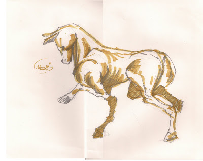
Royal Winter Fair Sketches


The horse is saying "neigh"


Those black strips are just pieces of black tape holding the tracing paper for the skeletal overlays on in case you were wondering.


See-through horse

For scientific Illustration we had to go out on a field trip to the royal winter fair to draw some animals. the next part was to take some of the animals drawn and make overlays of their skeletons. This is one of mine, for the larger part of it covering the entire skeletal structure of one of the animals. It turned out a lot better then I thought it was going to. Actually, my professor helped me with some of the small outstanding bits of the anatomy that horses dont 'normally' have. so this is the finished version that was handed in. I'll upload the other parts of the royal winter fair drawings before the weekend.

The Old man and the Russian Doll

Finally got this back. My favourite assignment from last year is released for all to see. The old man sees a small house in front of him, when he opens it he sees that inside is the same room as the one he's in with an identical old man opening a similar small house. suddenly the roof opens and a larger version of the old man is peering down upon the whole scene. Its a bit lynchian, y'know, a little existential. haha. I cant get enough of it. I'm very proud of this piece. Turns out I can do storyboards afterall

Wednesday, January 13, 2010

Plant


Just a plant I painted one day to try out a watercolour pencil crayon I bought. I think I used a coffee wash for the background. gave it a strange but pleasant effect, luckily with no strange but unpleasant smell :P


Monday, January 11, 2010

Caster Assignment


A technical drawing of a caster that was done during the better part of the semester. I included all three drawings in the image including a "spare parts" board (mainly used in case I screw up a step when using Illustrator) an exploded diagram showing what each part is and how it fits together as a whole and at the bottom a complex orthographic drawing detailing the ins and outs of each individual component. Fun, but my goodness did this take up a good chunk of the semester. Simple drawings were done on bond paper with pencil and ink, all the finals were printouts of illustrator files with the cadtools plugin.

But we werent done yet! A whole second part of it was done in computers class where we had to create an 'ad' for the caster with tone and a 'ghost' drawing on the housing. Sure it was more caster drawings, but at least it was something we were familiar with and creating the ad was incredibly fun. Not to mention learning how to create textures using photoshop. This was done almost entirely in photoshop with the labels created using Illustrator.


Shell Comparison drawings


The final project for scientific Illustration. This was done using the same technique I used for the skull comparisons. This time however there was no need for a placement outline because, as shells, they arent 'inside' anything really. This was a much stronger piece as far as reception went. I myself think its one of the strongest assignments I've had yet. In fact, it was a nice suprise when we were presenting to find that many of the problems I had with it (or thought I had with it) weren't problems at all as far as the professor was concerned.

The accompanying piece to the tonal comparison. A more detailed drawing labelling all the parts. I didnt think shells could be as complicated as the florida murex shell. The dont get much more complex though. Guess I enjoy a challenge since I B-lined towards that spiny thing the minute it was taken out of the box for us to choose.


Human Cyote Skull Comparison


One of the last but one of the largest projects done last semester for scientific illustration. Despite a couple hiccups I still really like how it looks. It's also accurate! My favourite part of it is the stylized skull drawings overlayed on the rougher shapes to demonstrate the bone's placement within the body.

Skulls drawn on graphite and scanned into photoshop, outline shapes roughed out on paper and 'perfected' with photoshop.

Thursday, January 7, 2010

Kickin' Deadpool


Pencil and paper. Overdrawn and inked. Inspired by the designs from a trade paperback I bought for a friend for Christmas.